Research First
The website administrator’s challenge is to enable researchers to access information quickly. It can be tempting to try and put lots of information and resources on the homepage of your site, but too much detail can feel overwhelming to users.
To improve how you organize and display information, you must understand the following through interviews and observations of people using your site…
- Primary use cases
- Existing pain points
- Users’ needs
- User expectations of the platform
Plan to organize information and resources on your website so it can be easily found. Your planning should include menu items, categories of information, where content can be placed, and the words you use to define the content. These simple steps can help your team organize information in an effective way.
- Think about your mission and goals.
- Make an inventory of content currently on your site.
- Define your user groups.
- What tasks do the different user groups perform?
- What would you like to add to your website?
- Are there services or resources you would like to promote?
- Review any analytics that you can access. Which features of your current website get the most usage?
Simple Search
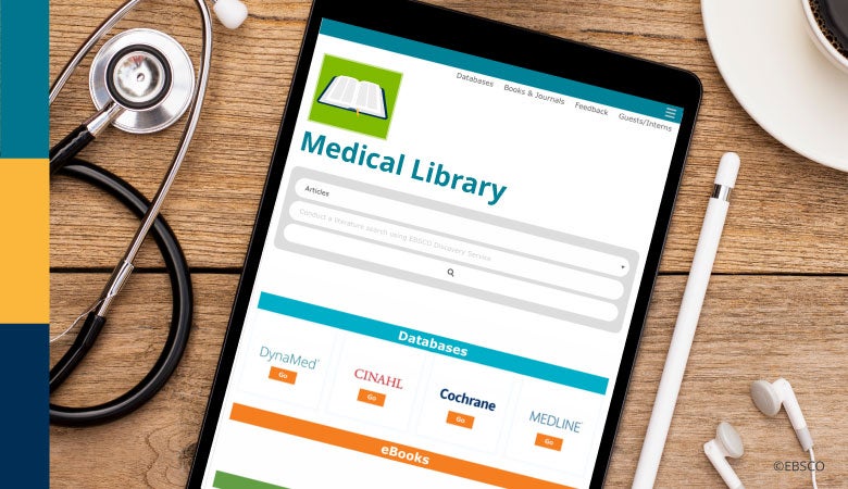
A single search bar is appreciated for its simplicity – with the capability to dive right into executing a search without the need to enter text into multiple fields or make multiple selections. Give researchers a clear starting point with a search box to increase usage through a Google like user interface.
White space adds balance to the page and allows users to concentrate on the content.
White space adds balance to the page and allows users to concentrate on the content.
Scan-ability
People tend to scan or browse page contents rather than read. They look for something to pop out to them, which is difficult with pages that are text heavy. As a result, users tend to miss or struggle to notice anything in paragraphs of text. Use bulleted lists for important information. The strategic use of white space on your site ensures that your library website is readable and quickly scannable. White space adds balance to the page and allows users to concentrate on the content.
Naming
Stick to a common naming convention that aligns with a single goal. Content categorization and labeling conventions should be clear and consistent - to facilitate findability, aid user understanding and promote value. Be clear and concise, use action-oriented language consistently throughout.
Include a help or tips section/page for searching your library. Label the short cut to this resource in a clear way, not just “Help”, “Training” or “Tips”, but also “…for using this library/site”.
Top navigation is a common paradigm familiar to users; move it toward the left for more immediate noticeability.
Visuals
Choose visual elements that relate to your institution's brand and/or logo. Colors, fonts and images should be consistent with your institution’s brand style. Limit the number of colors to create consistency in the visual. The hierarchy of content on the page shows the importance of information. Hierarchy is demonstrated by font size, colors, and placement on the page, with the most important content generally at the top of the page.
Your medical library has many resources to offer. The direction and strategy of your website should depend on the users. Create an exceptional user experience with Stacks, a web-based library content management system that was made by a librarian for librarians.