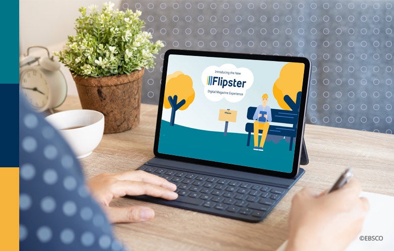
Flipster recently released a new, more intuitive and accessible user interface with the goal of improving user experience across all devices. With many factors including design direction, accessibility improvements and feature enhancements, we were curious how Flipster’s Product Manager approached the creation of the new UI.
Read the Q&A with Flipster Product Manager Colin O’Kane and learn how various efforts as well as many moving pieces came together to create the updated interface.
What was the motivation behind creating the new Flipster UI? How did user research and customer feedback play a role?
When planning for the new UI, we initially knew that we wanted the interface to have a similar look and feel to the new EBSCOhost, Explora, and EBSCO Discovery Service interfaces. In terms of feature enhancements, we reviewed all of our open Enhancement Requests for Flipster to see what specific features to consider alongside our initial ideas. After reviewing enhancement requests, we opened conversations with Sales, Training and Product Management teams to ensure we addressed frequent user pain points. We can’t overstate the importance of gathering feedback on our products from users and administrators alike, and we greatly appreciate the input that we’ve received over the years. We encourage feedback on the new Flipster UI as we continue adding new features that our users are looking for.
What role did accessibility play in the creation of the New UI?
EBSCO is focusing on improving accessibility across all platforms for all users, and we wanted to ensure that Flipster is included in that effort.
Visually, the new UI is less cluttered and generally easier to navigate than the classic UI. On the back end, we’ve ensured that elements of the page are properly tagged for use with screen readers. Additionally, the interface is now available in 31 different languages.
Our Accessibility team at EBSCO helped to provide guidance and conduct audits on the new landing page and magazine viewer alike. We’ve also developed an improved Flipster carousel widget that helps libraries promote available magazines on their website.
Overall, we can say with confidence that the new UI is largely more accessible, and we plan to maintain this standard on Flipster as well as other EBSCO products.
Which of the new features of the Flipster UI is your favorite?
Personally, I’d say my favorite new feature is the addition of the detailed record page, which I think also most improves user experience. The addition of this page allows for easy back issue visibility and access. In the new UI, all back issues are presented to users in a reverse chronological grid format so that they can quickly see how far back coverage goes. Users can also launch any back issues directly from the detailed record page and easily link to specific titles using the address bar’s URL.
How have libraries and users responded to the release of the new Flipster UI?
So far, we’ve received nothing but positive feedback and support for these changes. Libraries and users particularly love the back issue grid, the improved category browse experience, and the overall modernized look and feel of the interface.
Libraries also appreciated the seamless transition over to the new UI, which we aim for with all of EBSCO’s new releases. We understand that many of our customers might not have the free time or headcount to keep up with the latest releases from a variety of digital resource providers. For these reasons, we wanted to ensure administrators did not need to make any changes to their profile configuration as part of this transition.
Have any of the new UI features improved the ability to use Flipster in the classroom or in an academic setting?
The new ability to easily link to specific titles, back issues, and even individual pages within a particular magazine issue greatly simplifies the process of using Flipster in academic settings. Where a teacher may have previously had to say, “Follow this link, search for this magazine, open the February 2019 issue, and go to page 12.” They can now just say, “Follow this link,” and users will reach the exact article they need to view.
Currently, we are focusing on licensing academic and trade publications as well as thinking of innovative ways to improve our technology for students, teachers and faculty.
While it’s not new, the Flipster SmartLinks feature is a great tool for teachers incorporating EBSCOhost, EBSCO Discovery Service, and Explora into their curriculum. By offering Flipster SmartLinks, students can easily navigate from an EBSCO research database article over to the same article through Flipster, if that magazine is available in the library's collection.
What was your favorite part of working on the new Flipster UI?
Really, just seeing it all come together piece by piece was very rewarding. I have been using Flipster as a patron and supporting Flipster at EBSCO since 2016, so it was an honor to help bring about a new era for the product.
The new Flipster UI was my first release as Flipster’s Product Manager and it was a privilege to see the technical writing, mockup designs, customer feedback, as well as amazing developer work come together.
I like to write and record music in my free time and working on the new UI evoked a similar feeling as various ideas came together into a finished product. After executing a smooth transition to the new UI and receiving positive customer feedback after release, our team was reassured that we had accomplished our goal.
Learn more about the benefits of the new Flipster UI by reading our blog or watching our recent video.
Choose from more than 1,200 digital magazines on a variety of topics or add to your existing collection using EBSCOhost Collection Manager (ECM). Visit the Flipster website to learn more about Flipster digital magazines, sign up for our newsletter or to request more information.


