We interviewed Ryan Walter, Principal User Experience Researcher at EBSCO, to gain unique insights into the relationship between user feedback and development strategies and how both contributed to the UI evolution that seamlessly aligns user preferences and usage patterns. Keep reading to learn more about the importance of user testing and the influence user feedback had on enhancing the UI experience in EBSCO Discovery Service (EDS) and EBSCOhost.
Could you elaborate on the role of user testing and feedback in shaping the development of the New UI for EBSCO Discovery Service and EBSCOhost? How did EBSCO ensure the user's voice was integrated into the process?
User testing is an integral part of our design practice at EBSCO. In the time I’ve been a part of EBSCO’s UX research team, we’ve run hundreds of studies looking closely at the needs, goals, and behaviors of all of our users, from academic librarians to college students, public library patrons, medical practitioners, and industry-leading researchers. We use a variety of research methods to collect this data, including contextual interviews, usability testing, concept testing, card sorting, benchmarking, and A/B testing, to name a few.
In the case of the New UI, my team and I spent years observing the challenges students encounter when using traditional library interfaces. In designing the new EDS and EBSCOhost, we wanted to focus on the student experience and make sure they didn’t feel intimidated or left out.
What were some key insights or challenges that emerged from talking to students? How did these insights guide the design and functionality changes for the New UI?
We’ve interviewed many undergraduate and graduate students about their research needs while designing the New UI. That research is ongoing, but from the start, a few major themes aligned student experiences across disciplines and institutions.
First, students typically conduct research independently and under a tight deadline. This research almost always supports class assignments, of which they have many over the course of a semester, often simultaneously and in a diverse set of subject areas. They do this work on weekends and evenings and are generally disinclined to ask for help, so they’re not partnering with their teachers or librarians. Maybe they’ve had some library instruction, maybe they haven’t. Either way, they’re in a position where they need to find resources quickly, and they need to find them on their own.
Second, these assignments are typically highly structured with a clear set of requirements and expectations for acceptable sources, so naturally, students’ approach to the research is highly practical. They’re looking for impactful, relevant, full-text documents they can download and quickly digest so they can get to writing and moving the assignment forward.
Third, and most importantly, they’re trying to do all this on a library interface that, by their standards, is outdated, confusing, and far more complex than their needs require. Today’s students expect digital experiences to be inviting and intuitive, distrusting dated, over-stuffed interfaces that don’t conform to modern design standards. These expectations are formed broadly and from a young age by mobile technology, app design, social media, and search engines that support natural language searching. This is why students are increasingly drawn to open-web databases like Google Scholar or JSTOR; they’re more modern and more understandable and tend to better fit students’ mental model of what a search experience should feel like. I often return to a quote I heard from an instructional librarian on students’ reluctance to seek out library resources: “Our students want things to just work. They’re trained by Google to expect results from a few keywords or a whole phrase. They’re not expecting to have to be taught how to use something.”
So, from the start, a key goal for the New UI was to design an interface that empowers students to effectively perform research on their own and inspires them to further explore their library’s resources.
Can you provide specific examples of user needs or pain points identified through feedback? How did these insights lead to targeted improvements in the New UI?
A great example of this is the updates we’ve made to filtering. Filtering is a key part of many users’ workflows, including students, who often prioritize full-text, peer-reviewed resources in direct response to the requirements of their course assignments. However, we had also seen from extensive usability testing that many of the filters on display in the Classic UI – content provider, geography, location, and others – are misunderstood by students and, as a result, likely to be misused, leading to low-yield search results, confusion, and needless frustration. Further, the presence of these additional filters often made it more difficult for students to identify the filters they were looking for, increasing the cognitive load needed to carry out common research tasks.
When we looked at raw usage data of filters in Classic, we saw a similar story. Filters like “full-text,” “peer-reviewed,” “at my library,” and date-based filters comprised nearly all filter usage, while the remaining filters each comprised less than 1% of overall filter usage.
This data got us thinking about prioritizing filtering options based on usage and need. It was clear that most users didn’t need most filters most of the time. Several rounds of design and testing led us to the development of quick filters, which highlight the most commonly used refinement options directly below the search box, with the lesser used filters accessible in a separate panel as needed. These changes to the filtering workflow are frequently cited as a welcome improvement in our usability benchmarking studies. Students, in particular, find it much easier in the new design to identify the filters that meaningfully impact the efficiency of their search and the quality of their results.
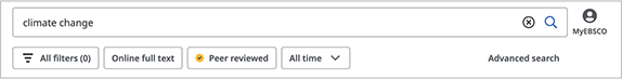
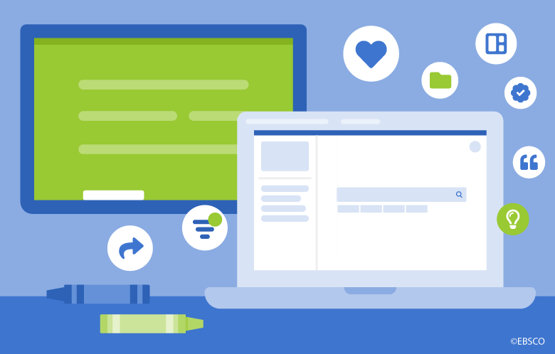
Example of Quick Filters in the New UI
Another example is the choice to default a fresh instance of the New UI to basic search rather than advanced search. Like filtering, advanced search is an area that historically confounds students, offering a host of limiting and searching options that often exceed their needs and understanding. In nearly all our observations of organic student search behavior, we have seen that students simply want to throw a few basic terms or a phrase into a search box and start viewing results. After that initial search, they may review the top 5-10 results for just a few seconds before refining their search terms again and again, each time getting critical feedback on which terms lead to the most relevant and promising sources. Even in our studies with faculty, when asked to demonstrate how they typically conduct research, they may start with advanced search, but ultimately fall back on the same simple, iterative keyword approach employed by their students.
Thus, when it came to locking in search workflows in the New UI, we decided to default to basic search over advanced search simply because it offered the most approachable and practical starting point for most of our users. Having just the single search box with a few key limiters reduces overwhelm, encourages interaction, and jumpstarts the research process, getting students into depth fast.
Could you share instances where user feedback is directly translated into new features or modifications in the New UI? How did you ensure that user suggestions were effectively incorporated?
As I mentioned earlier, a resounding theme we’ve heard in our conversations with students is that they are typically juggling multiple assignments that require research across a disparate class load. As a result, their research efforts are often touch and go, varied, performed in more than one sitting, potentially on more than one device; in short, they are never not multitasking. These work habits reflect students’ (and all users’) growing expectation that work done online is captured, cataloged, and retrievable. If I glance at an article on Tuesday, the expectation is that I can easily go back and see it in my viewed items on Thursday.
The prominence of the dashboard in the New UI responds to this expectation, highlighting research organization tools like saving and projects that allow students to quickly bookmark key sources and differentiate between multiple assignments. It also makes switching between laptop and mobile a breeze, as students are no longer relying on tabs they had open on one device to transfer to another.
All this results in a toolset that gives students a sense of ownership over their research experience and promotes repeat usage of their library website and library resources.
User feedback often contains diverse opinions. How did you navigate this diversity to strike a balance between advanced functionality for experienced users and a simpler experience for newcomers?
Feedback from librarians, particularly instructional librarians, is and has always been, an essential component of our research. We’re committed to creating an interface that allows librarians to teach research methods and information literacy skills while empowering students to discover relevant, trustworthy content on their own. For librarians and more experienced researchers, we are continuing to bring more and more advanced search features to the New UI, including search options, search history, and thesaurus functionality. Our goal is to make advanced search a destination for the experienced user who relies on sophisticated search tools to advance their research, train new generations of scholars, and make significant contributions to their field.
Did you observe any measurable improvements in usability metrics or user satisfaction because of the changes made in response to user feedback? What were some standout outcomes?
One of the primary ways we measure a product’s in-market success is through usability benchmarking. EBSCO’s user research team performs periodic usability benchmarking of New EDS with students, faculty, and librarians from across the globe. Participants are asked to complete a series of common research tasks and rate the ease of completion. Responses are then calculated according to the System Usability Scale (SUS), providing an overall usability rating from 0-100, with a usability baseline of 68.
In the seven benchmarking studies we’ve performed since the release of the New UI, we’ve seen an average SUS of 92 among students and 84 among faculty and librarians. In our most recent benchmarking study conducted in July 2023, we saw a SUS of 97 among students, which is remarkably high. We also saw high scores on overall ease of use, confidence of use, and likelihood of use among students. This was heartening for myself and my team because, as I mentioned, increasing student usage and confidence was one of the primary goals in designing the New UI.
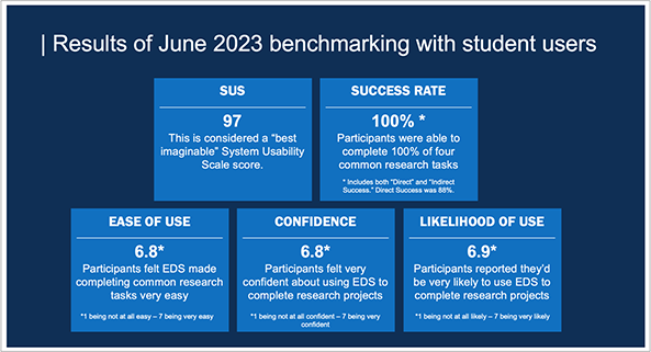
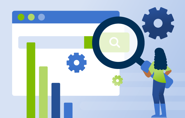
Overview of results from the July 2023 benchmarking study of New EDS
Factors students consistently attributed with the likelihood of use included quick filters, ease of citing and saving, simplicity of search, highlighting of search terms when they appear in the results list, and the overall clean, modern aesthetic of the experience.
How do you engage users in the ongoing improvement of the New UI post-launch? Are there mechanisms in place to encourage users to share their experiences and suggestions?
We are constantly engaging students, faculty, and librarians in conversation about the New UI and fielding research designed to generate critical feedback on new features and refinements. This past year, we conducted an in-depth study on filter usability to improve workflows for users who use filters heavily. The results of that study led to a series of usability improvements to the filter panel currently in development. These improvements focus on making it easier to navigate the filter panel, making active filter selections more visible and discoverable, and introducing sticky filters for maintaining filter selections when making search refinements in advanced search.
In your view, how has the integration of user testing and feedback enriched the development process of the New UI? What message would you like to convey to users and institutions about their role in shaping these tools?
User testing has moved us from a development model that looks solely at the market to one that is curious about the shifting needs and expectations of all our users. It’s put our efforts into solving problems we didn’t previously know existed and expanded our sense of the library user to include a more diverse set of behaviors and attitudes. Striking a balance between the diversity of needs in our user base isn’t always easy. Still, the challenge is worth it, and I think the changes we’ve made to the New UI will result in greater student usage and awaken newfound enthusiasm for their library’s resources.
_ _ _
The development of the New UI for EBSCO Discovery Service and EBSCOhost stands as a prime example of user-centric design. Through extensive user testing and feedback, we gained insights into the diverse needs and behaviors of our user base, resulting in practical improvements such as prioritized filtering and streamlined search options. The remarkable usability metrics, including an average System Usability Scale (SUS) score of 92 among students and 84 among faculty for EDS, underscore the positive impact of these changes. Ongoing user engagement remains central to our refinement efforts, ensuring the New UI remains aligned with evolving user expectations. This collaborative journey between users and developers emphasizes the transformative power of integrating user feedback into the development process, ultimately creating an interface that serves as a testament to the effectiveness of user-centered design.