Infographics are invaluable storytelling tools and a great way to share all of the wonderful things you provide to your community. They turn data into attractive visual representations that are easy for people to understand. Whether you’re creating an infographic on your own or customizing a template in LibraryAware, here are some tips from our LibraryAware team:
1. Create an outline
An outline can help you to lay out the pieces of the infographic. Decide which points are essential for getting your message across. What are the essential elements of the story you wish to tell? Is there a beginning, middle, and end to that story?
2. Have a clear title
Start by adding a title that clearly defines what your infographic is about. There should be no mystery about what the story is that you are telling. Use a short, catchy title that is easy to understand and gets your target audience’s attention.

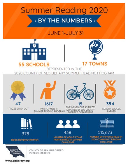
"Summer Reading By the Numbers" infographic created by County of San Luis Obispo Public Libraries.
3. Choose the right fonts
Limit yourself to two fonts for the infographic – one for the title and header and one for the body of the infographic. You can use a more fun or decorative font for your title and header but keep your body font simple, so it’s easy to read and not overwhelming when skimmed at a glance. Choose a font combination that complements the topic of your infographic. If your topic is related to storytime, choose a youthful font for your title and headers, such as Schoolbell. Your body copy can be a complementing simple font, such as Quicksand.
4. Choose the right colors
To keep your infographic easy to read and visually appealing, stick with no more than three to four colors that work well together. You can use your library’s branding colors, or you can create a new color palette. LibraryAware templates use professionally chosen color combinations, or you can search online for free color palettes to help you choose your own. Make sure the colors you choose communicate your topic. If you are creating a storytime infographic, choose vibrant and youthful colors. For an infographic targeting job seekers, select colors that are more traditional and toned down.
5. Keep it clean and simple
Your goal is to communicate a lot of data in a simple, easy-to-understand way. Your infographic should not be so busy that it’s overwhelming or confusing to the reader. Leave plenty of white space between each statistic and use minimal text. Your infographic should mostly use graphics and visual elements to communicate your data.
6. Graphics, graphics, graphics
In LibraryAware, we have thousands of icons available for your infographic needs. Just search “icons” and any additional terms such as specific colors or topics. When choosing graphics, make sure that they look like they belong together. They should have the same style and colors, if possible. This will provide a more attractive and cohesive overall look.

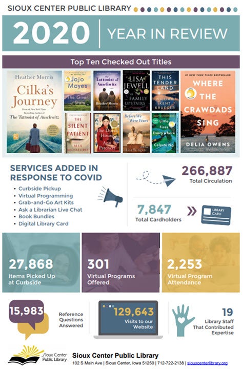
"Year in Review" infographic created by Sioux Center Public Library.
7. An easy-to-follow layout
Organize your infographic in a way that flows and tells a visual story. There’s a natural hierarchy in how people in Western cultures view images and text. The most crucial information is more prominent, at the top, and typically read or viewed from left to right. Organize your information with that in mind.
8. Use your branding
Add your library’s branding to the infographic so readers know that you created it. You can utilize LibraryAware’s branding block feature or add your logo to the template and include your website URL. By adding your branding, you increase your brand recognition and drive visits to your website, social media, and in-person visits to the library, too!
9. Don't forget to promote
After creating your infographic, share it with as many people as possible. Upload it to your website, share it on social media, email it to your subscribers, and even blog about it. Make sure that others can easily share it by providing a link to the infographic itself and including a call to action to encourage your followers to share it with their audiences.
10. Infographics as advocacy tools
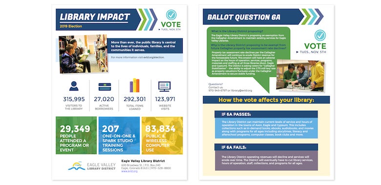
Does your library have an upcoming ballot measure? Or are you in the consideration phase? Infographics are fantastic ways to tell the story of your library and all of the activity and value it provides for your community. They serve as a succinct yet powerful tool to show all that you do, whether you are sharing with your board, foundation, or voters. Here is an example of an infographic created by Eagle Valley Library District for their 2019 measure:

"Library Impact" infographic created by Eagle Valley Library District.
LibraryAware customers have access to over 40 infographic templates. Just type “infographic” into the LibraryAware homepage search bar to find them.
You can also get some more ideas for advocacy in our webinar with EveryLibrary and Riverside Public Library, "Ballot Success: A Case Study," which includes a 15-minute LibraryAware training on how to access, edit, and post library advocacy and marketing materials.
Denise Turner is a Senior Graphic Designer for NoveList. She is currently reading The Family Upstairs by Lisa Jewell.


