Happy accidents happen! I wouldn’t have guessed it then, but my career path to marketing began with the clumsy creation of my first 8.5 x 11 program flyer for the children’s department at my old library — something my unused biology degree had not prepared me for. I had never used any software to make signage before and I was delighted to learn absolutely everything. And, whoa, did I enjoy it. Instant obsession.
This tasking of graphic design duties to non-designers is common. Many libraries have no marketing department, so library staff need to figure it out on their own. Or there is a marketing department but they’re overburdened. Frequently, it’s the person with a willingness of spirit who becomes this accidental designer.
Here at NoveList, we care about libraries and the people who run them. Our staff has a lot of library expertise, and nothing makes us happier than finding ways to help. I hope that these five tips help you make your design work a little easier and a little more fun.
Tip 1: Consider what kinds of pieces will best support your event, resource, etc.
Before you start designing, talk with the department, point person, or program planner about what pieces will best promote the service, resource, or program. You’ll want to ask about the target audience so you can choose the most appropriate pieces. How old are they? Are they learning about the service, resource, or program when they come into your library, via email and print newsletters, or on social media?
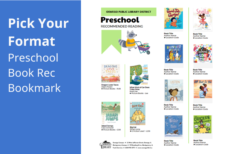
If it’s a program promotion, consider whether you’re designing for something new, or something established. With the latter, promotional materials can probably be at a minimum. Representation on that monthly calendar may be enough! But with something new, you’ve got to get awareness — no easy feat — so consider making more kinds of pieces. I’m not saying you’ve got to paper the town. But a new program needs more than a bookmark.
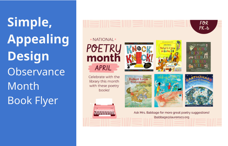
Tip 2: Keep the design simple across all promotions
The advice to keep things simple isn’t just to save you time! You’re also competing with people’s short attention spans. With the small amount of time you’ve got to get people to read your flyer, every second counts. Both the amount of information on your flyer and the layout matter for readability and retention of the information.
Here are the necessary elements of a promotion piece.
- The header: Put the most important information at the top: The name of the service, resource, or program — or a short phrase related to one of the latter. Use an easily readable font that’s bigger than any other font on the page.
- The copy: People generally read from top to bottom, looking at the largest fonts first. After the header, prioritize a subheader (if needed) and a short body of copy. For a program, this will include the date, time, location, and a concise event description. Use no more than two fonts per piece. Learning about “font pairing” is a fun little rabbit hole of research, if you’ve got some time.
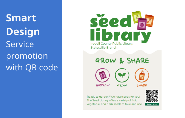
- The link or the QR code: If you need people to know more or register, provide the link or a QR code to the place on your website where they can do what they need. QR codes are a great way to get people quickly from the printed page to the screen, and are excellent on digital signage, too! (Don’t bother with QR codes on email graphics — if they’re reading your email from their phone, they won’t be able to scan it.)
- Contact info: Include either your library’s web address or an email address where people can get more information. Work with the department, point of contact, or program planner to figure out what is best.
- The logo: The library logo needs to be on your piece. Full stop. Have a program sponsor? Their logo might be necessary, too.
Tip 3: Make wise choices regarding the look of your promotions
While you could make a poster with only words on it — and that could be awesome if it’s thoughtful and intentional — chances are, you want more than that. Here are some tips about creating a look.
- Follow branding: This is “the look” your library has chosen for all its marketing. The fonts, the colors, the logos, the imagery style, the voice, and sometimes even the words you say are taken into consideration in graphic design. If your library has branding and/or style guidelines, make sure you follow them. Branding is important because it creates a cohesive user experience for your community with all your communications.
- Imagery: Consider the tone of the program or resource and the audience when selecting imagery. People like to see happy faces, examples of the things they’ll be doing or making in the program, and photos that match the vibe. Customers of LibraryAware have access to thousands of stock images with a library-focus.
- Diversity in imagery is also important. Your promotional pieces should reflect your community and the real world, specifically through race, age, size, sexual orientation, and disability.
- Only use high-resolution photos in your promotional pieces. Give your promotion all the credit it deserves!
- White space: Empty space provides relief for the eyes. And you can use white space to guide people to the next bit of info you need them to read. The more space you leave around an object, the more likely someone is going to see it.
Tip 4: Edit or regret it
After a piece is made, you’re not done. It’s time to review it for errors. There’s nothing worse than the feeling of seeing a typo on your big, beautiful poster that’s been displayed for a week. Make sure you, the designer, are not the person with the only eyes on it. Ask the department, point of contact, or program planner to help you review and finalize every piece.
Questions to ask during the review:
- Are there any typos or spelling errors? Is the program info accurate?
- Is all the info there that needs to be there? If you were waiting to get that registration, website, or catalog link so you can make that QR code, don’t forget about it.
- Did anything go wrong with the branding? Did you forget to change that default font to your brand font? Did you forget to stick the logo on there?
Pro tip: Do not take edits personally, especially when it’s constructive criticism. I can easily say this now, after how many years of receiving feedback, but it’s important to remember that it takes a village.
Fun aside, I want to draw attention to a time a typo went fantastically well. Do you remember when the Pflugerville Public Library in Texas had to issue a correction to their local paper about their Anti Prom program? Their hilarious response on Facebook said, “There was a typo in a local paper that said we will have snakes. We will have snacks. Snacks is what we will have.” It went viral. Sometimes, you just need to run with typos and try to turn them to your advantage. I would love to know how many people ended up going to their Anti Prom.
Tip 5: You are a library! Promote your books!
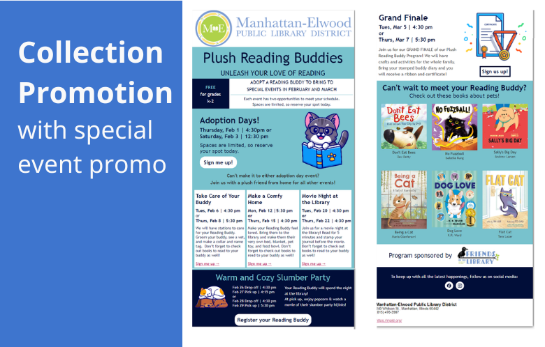
The soul of a library is its books and people should always be reminded of that. Besides making all the book display signs, bookmarks, reading maps, booklists, author feature posters, March Madness book tourneys, Picture Book Month signs, book trackers, book bingos, Banned Books Week things, reading logs, bookish holiday signs, book sale flyers, book quote signs, book club kit collateral, and staff picks shelf talkers...did you know you can also insert collection promotions into your program promotions? If you’re making a flyer for a pottery class, why not stick a related Pottery for Beginners book jacket onto the flyer, too? Think, “If you like this program, you might like this book!” You can promote books practically anywhere.
It’s time to get designing!
Graphic design flexes our creative muscles and it can be hard work, but it can be tons of fun, too! I’m not trying to sound like Joy from “Inside Out” but find that fun and watch your skills improve. Your muscles will get stronger. Pay attention to your coworkers and patrons to determine what gets a good response. After a while, you’ll know instinctively when a design will work, and that’s when it gets real fun.
Are you feeling more ready? Awesome. We can’t wait to see what you create!
If you want design work that’s easy and fun, check out LibraryAware. It has everything you need to promote your library, and there are thousands of ready-made templates created with libraries in mind. No other design platform offers book display signage or a whole campaign of pieces for Library Giving Day (the best giving day of the year!).
Leigh Gaddy is a Lead/Demand Gen Marketing Specialist for NoveList. She is reading The Dallergut Dream Department Store by Miye Lee.