Overview
Located in the heart of Dubai, the American University in Dubai (AUD) offers undergraduate and graduate degree programs covering a range of disciplines including business administration, engineering, communication and media studies, the arts and sciences, and education. To support the research needs of over 2,000 students and faculty, the AUD Library maintains a collection of more than 50 databases, 200,000 eBooks and 44,000 print items.
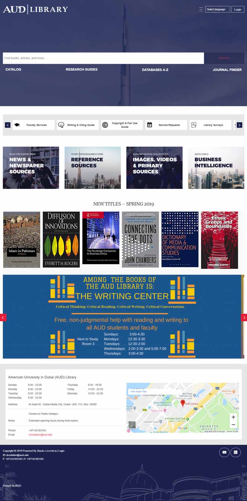
The library subscribes to a variety of e-resources through EBSCO including Academic Search Complete™ Business Source® Ultimate, Communications & Mass Media Complete™, Education Research Complete™, the EBSCO eBooks™ Academic Collection and EBSCO Journal Services. In addition, the library has implemented EBSCO Discovery Service™, a powerful research platform that enables users to search across all the library’s holdings at once. Most recently, the library launched a new-and-improved website powered by Stacks, a fully hosted web platform available only through EBSCO.
Challenges
According to Elizabeth Thompson, Director of Library Services, the previous AUD Library website offered a clunky and inefficient user experience. Layers of pages and links made it difficult for students and faculty members to navigate to the resources and services they needed. In addition, the library team did not have administrative access to the website and had to rely on other departments to make changes. As a result, the website often displayed outdated content.
The Library realized that, in order to improve the library’s visibility and increase usage of resources, the website would need to provide a more intuitive user interface that could help users find the right resources in the least amount of time.
Solution
Evaluation
Upgrading the library website was initially part of a larger conversation around AUD’s overall web strategy. Concerned that the University’s web strategy might not solve their unique challenges, AUD Library’s senior team — composed of the library director and two senior librarians — took the initiative and began exploring library-centric web platforms.
Usability, learnability and design were critical factors in evaluating solutions. “We specifically wanted a platform that was consistent with current trends in web design and immediately familiar to our users,” Thompson said. “From the administrative side, we needed a platform that was manageable to administer given our small team and competing responsibilities.”
After consulting with the AUD’s communications and technology departments on branding and integration requirements, the Library team identified the Stacks web platform as the best option to serve both their design and functionality needs.
Implementation
With user-friendly features such as a drag-and-drop administrator dashboard and platform built on current web design practices, Stacks would enable the AUD Library to build the best website experience — one that would streamline research for users while helping to increase library usage.
“We decided to pare down the landing page and remove additional blocks of information on the template design, keeping the focus on resource and service access,” Thompson explained.

It was also important that the library website provide a seamless experience for users coming to it from the new university website, Thompson said. To help the library achieve a consistent look and feel, AUD’s Communications department provided the Stacks implementation team with branding guidelines, images, a color palette and fonts.
Promotion
In December 2018, the team held a soft launch of the new website and surveyed the Library Advisory Committee, which includes faculty and department heads. The survey tested usability, learnability and design. Results showed that committee members found the site visually pleasing and easy to navigate, and most found sources with relative ease.
Once the committee was on board with the new site, the library officially rolled out the new website to students and kicked off a month-long marketing campaign to promote it. Student library assistants served as marketing ambassadors, wearing cardboard posters around campus and inviting their peers to see the library’s new website by scanning the poster’s QR code. The library also posted photos of students scanning the QR codes on the university’s Instagram account.
Benefits & Results
To date, feedback on the new library website has been overwhelmingly positive. For library staff members, promoting and instructing library users on a website designed and controlled by the library has created a better user experience for students.
“It is easier to manage our users’ expectations,” Thompson said. For example, based on user feedback, issues with visibility and accessibility can be quickly addressed, additional resources can be added to the template design, and resource descriptions can be changed to improve clarity.
In addition, the Stacks’ customer support team has been quick to respond to questions and make changes as needed.
For a small library team, the experience from trial to implementation has been very manageable.