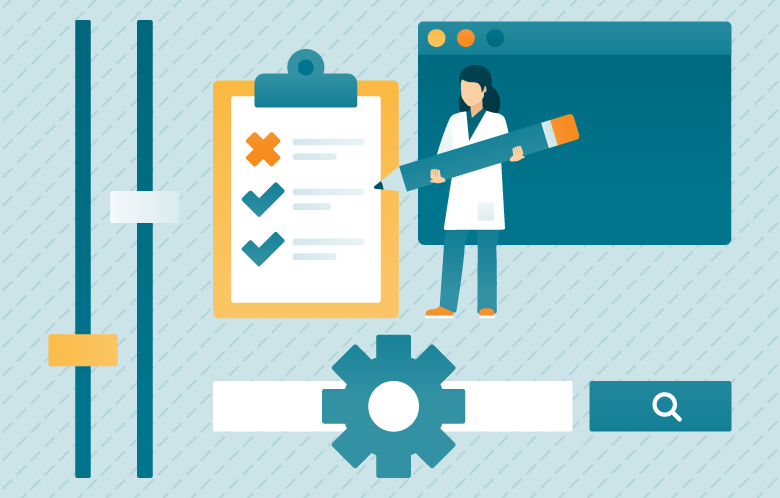
We recently posted about the importance of leveraging a SUS, or system usability scale, to measure how user friendly your medical research platform is. A SUS is a great way to see how your medical research platform’s user interface (UI) measures up for users, but also it creates universal feedback from your end users, helping to influence every component of the platform and UI elements.
Another avenue to explore when evaluating your medical research platform is to step outside the mindset of clinical research to see how other companies leverage thoughtful UI. For example, Adobe is a software company known for its multimedia and creativity software products which include Photoshop, Acrobat Reader, and Adobe Creative Cloud. On Adobe’s company blog, this post outlines the 4 Golden Rules of UI Design. This includes placing users in control of the interface, making it comfortable to interact with the product, reducing cognitive load and making user interfaces consistent. Even NetFlix, a streaming service that EBSCO looked to when redesigning the UI of EBSCO Discovery Service (EDS) Health, includes common UI capabilities that translate well into the research world, with elements such as a personalized dashboard and related resources. A good UI in your medical research platform is more than something that just looks good. It is meant to help the user connect with the right information for their knowledge.
But now, let’s dive a little bit deeper into the three S’s for a good UI.
Simplicity
Simplicity in UI design is not just a trend. Some minimal UI elements have evolved into best practices. While a medical research platform is serving complex needs, the way in which users interact with it and access information needs to be as simple as using a smartphone. A simple UI will help users save time in their research and provide clear access to content that is the most relevant. When EBSCO began redesigning the interface for EDS Health, we started with the company’s simple yet powerful mission — to transform lives by providing relevant and reliable information when, where, and how people need it. Many of the elements in the new EDS UI have been simplified. Take the case of the search filters, which are collapsed into a drawer. This reduces the cognitive load for all users and makes navigating the page easier. Reducing cognitive load is a key usability consideration that applies regardless of a user’s ability. Simpler designs reduce the number of steps and time it takes to complete a task — something everyone benefits from. This simplification has also led to a cleaner, more aesthetically pleasing interface.
While a medical research platform is serving complex needs, the way in which users interact with the platform and access information needs to be as simple as using a smartphone.
While a medical research platform is serving complex needs, the way in which users interact with the platform and access information needs to be as simple as using a smartphone.
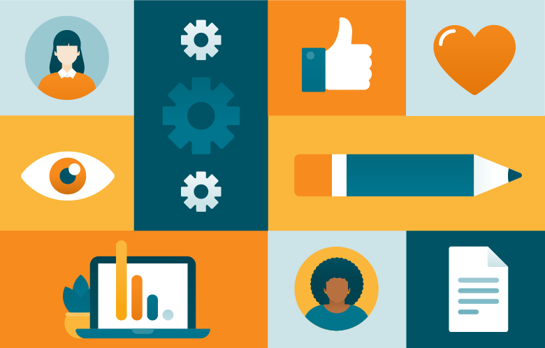
Small Stuff
User feedback through various means (usability testing, card-sorting exercises, focus groups) not only provides a clear direction on the simplicity of the UI design, but also provides insight into the “small” elements that can help increase usage of a medical research platform. When conducting user testing for the EDS UI, the EBSCO User Research team found several elements that were must-haves to properly conduct research and access the content vital to the research project.
- Highlighting Search Terms in Results List - Researching a specific topic for a long period of time can make search results seem like a blur. Highlighting the search term throughout the results list can keep a user on track.
- Peer-Reviewed Indicators - Know the peer-reviewed content that saves researchers time and provides a preferred path of peer-reviewed content.
- Citation - Citations are key in medical research and the ability to quickly copy, paste or export to an outside tool helps users save time and creates a consistent and foolproof method around citing sources.
Specialized
Specialized elements like a dashboard are something that we have grown accustomed to in our video and music streaming services. We like to know what we have watched, what we have searched, and to have our entertainment content organized in a way that is easy to find and access. The same should exist in a research platform. Medical research is often conducted at various point during the day instead of a single sitting. Having a personalized space for users to return to find past searches, saved items or viewed items brings them quickly back into their research. There is minimal information “stumbling” when you can quickly see immediately what has already been accessed and interacted with. The ability to organize information by project helps keep a researcher on track with their work and arranges what could be an overwhelming amount of information into specific needs, ideas, or projects.
EDS Health delivers a new search experience with a redesigned user interface that upgrades how clinical researchers can access, search, choose and use their medical library’s resources. By combining the excellence of EBSCO’s search technology with a new interface and many new features, clinical researchers can take even greater advantage this medical research platform. Watch the video to see how.