The main purpose of a medical library website is to connect a variety of users — from clinicians to researchers — to the most relevant information for their search. If the website is the “face” of the medical library, it must be displayed in a way that satisfies user expectations while delivering relevant results in the least number of clicks. But what if the “face” of the library is not so appealing? What if the core elements users expect are not part of the composition of the site? How can you easily transform a medical library website into something of “research beauty”?
First, assess whether your medical library website is creating barriers for researchers. Are they having a hard time finding resources? Is the medical library website creating more silos than connections? Do you often field questions about resources that you think are easy to find, or are there important paid resources that are not getting the usage you expect? If you answered yes, your library website is not doing its job. One of the reasons your medical library website may not be working is because it does not reflect user experience (UX) best practices.

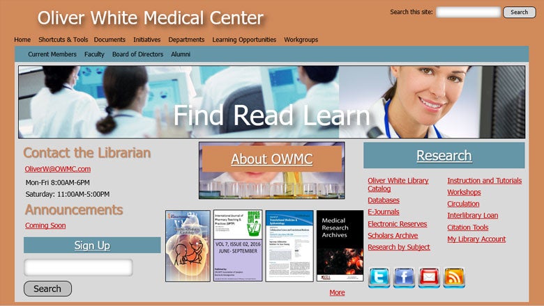
Before: Typical Medical Library Website
Some of the most common UX best practices include responsive design and a single search bar that’s front and center. Responsive design means your website will adjust to work on any device (e.g. mobile, tablet or desktop), The search bar should be prominently placed on your medical library website with a call to action so it’s apparent what users can do with the search option. What’s more, the search solution must ensure that users are met with the most relevant information within the search results.
A modern web platform combined with a robust discovery integration are the two keys to transforming your medical library website from a beast to a beauty.
A modern web platform combined with a robust discovery integration are the two keys to transforming your medical library website from a beast to a beauty.
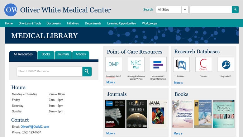
Clear organization of resources with clean visuals and headlines allows users to immediately hone in on the right point-of-care resource, journal, book or database for their need. Some users already know which resource they want to access and may not need to do a general search. Give them the option to jump right into their resource of choice, like DynaMed Plus or PubMed. Keep in mind that each user takes a different path to accessing information. While some users want to use a search bar or select a resource of choice, others may want to explore content by type such as journals, articles or books. Offering multiple ways to access information (through a secondary tabbed search) ensures that users can easily complete their research.
To limit confusion, make sure to customize your medical library website with your medical institution’s branding. This allows users to feel like they are in a familiar starting point, rather than being taken away from the institution.

After: Stacks and EBSCO Discovery Service Health Implementation
Finally, the best way to create an optimal user experience for your medical library website is to employ tools that facilitate these core needs. A modern web platform combined with a robust discovery integration are the two keys to transforming your website from a beast to a beauty.
