Here at EBSCO Information Services, we invest heavily in an internal accessibility program. We look to build accessibility into EBSCO’s culture and have subject matter experts across product, design, content production and development teams. Even with these efforts, external third-party audits are a valuable tool to help ensure the accessibility of our products. Recently, EBSCO went through a Web Content Accessibility Guidelines (WCAG) 2.1 AA audit of the newly evolved EBSCO Discovery Service™ (EDS) interface, led by Deque Systems, a leader in digital accessibility.
The audit was planned during the Beta for the new EDS interface, allowing us to compare audit results to beta feedback and plan improvements accordingly. Prior to the audit, EBSCO conducted an internal WCAG 2.0 AA review and fixed many of the issues found in that review. Most of the issues in the Deque audit were therefore WCAG 2.1 issues.
WCAG 2.1 was released as a standard in 2018. It covers several new cases that were not accounted for in the original WCAG 2.0 standard from 2008. Many of these cases are related to mobile or small screens, or cover items that were not in scope for WCAG 2.0, including contrast of graphical elements.
Deque delivered the audit results in June 2020. After discussing the issues with their testing team, EBSCO set about reviewing the results with our accessibility product manager, design team and engineering subject matter experts.
The most common issue in the audit by far was related to contrast of non-textual elements. This required some updates to our design system and the code components that we used as the building blocks of our new user interfaces. The audit uncovered a small number of common issues that we needed to address in order to ensure our systems maintain compliance throughout the new UI’s development.
Contrast issues
In Spring of 2020, the EBSCO teams went through an effort to tighten up the text contrast throughout the new interface. During this process, we did not address non-text contrast, a newer WCAG 2.1 concept. Here are some of the common non-text contrast issues that were found:
- Contrast of buttons in a selected state.
- Blue is the core of EBSCO’s brand colors and used throughout our interfaces. Our selected buttons used a blue–on–blue color — the background was too subtle to contrast with white, and the darker color was too close to black.
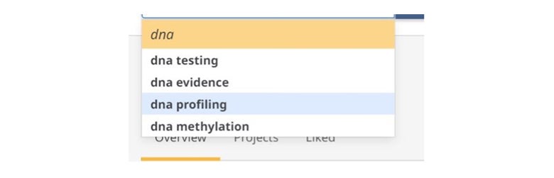
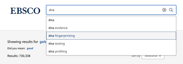
- Selection of items in a dropdown list.
Here we also were using a subtle blue color that did not contrast enough with the white background.
Screenshot from the audit of EDS showing insufficient contrast for the selected state in the main search autocomplete
Updates to design system
As the design team worked through many of the contrast issues, updating the examples and documentation in our design systems proved to be a valuable exercise and tool. The design system allowed the UX Design team to harmonize our design patterns across multiple components and communicate effectively with product and development teams.
The design system also allows us to test and do other accessibility checks prior to development implementation. For example, we have added the ability to easily test contrast ratios in the UI. Whether UI updates are from an audit, technical implementation, or business decisions, having a design system as part of our workflow has been helpful in keeping design and development teams in sync.
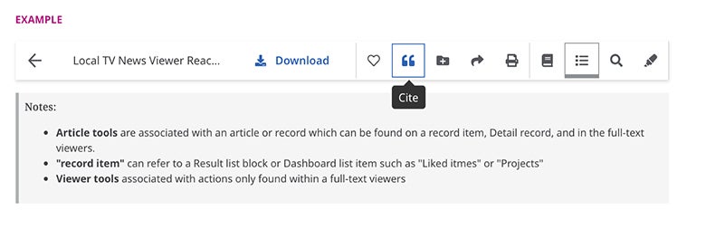
An example from EBSCO’s design process for a content viewer toolbar – the “Cite” button in the above screenshot now has a higher contrast selected box
Updates to component library
After incorporating the new colors into the design system, we had a ready-made set of requirements for teams to apply to our web component library. Our components are building blocks — an update to a component will be pushed out to all instances of that component. For instance, the above button styling update was applied to all buttons in the next generation of the UI after the fix was complete. This not only saves a lot of time but helps ensure consistency throughout the product — the result being a better experience for all users.
Screenshot from EDS after implementing changes from the audit – the autocomplete now has a higher contrast box to indicate selection
This audit was an informative and valuable exercise to inform accessibility during the design phase of the next generation of EDS. It showed us the strengths of our design and development processes, as well as the areas where we needed improvement. Now that we’ve had a chance to review and fix the issues, our teams have stepped up their accessibility knowledge. The lessons learned in this process are now reflected in EBSCO’s design and feature planning and we are working to incorporate them into internal accessibility training, providing a better and more equitable experience for end users.